 IBO Boxing Honesty and Integrity
With a little over a month until training camps begin – all has been pretty quiet in Islanders’ land as of late regarding player personnel. With the coaching staff being further solidified with the recent appointment of Piero Greco as head goaltending coach, and Mitch Korn coming aboard as Director of Goaltending – all seems to be finally heading in the right direction with the franchise. (Check out my article on Mitch Korn HERE.)
And then there’s talk about bringing back what I consider a cold-sore in the Isles history…The dreaded Fisherman logo and/or colors for a third jersey… Ugh, PLEASE, for all that it is worth – let the fisherman die.
Why, oh why, would this even be a consideration?!
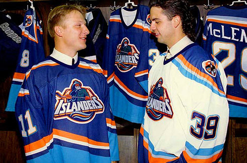
Let’s think back to those glory years, back in the ‘95-’96 campaign when Islanders brass thought, “Hey, you know what we really need to do? Completely change the identity of this franchise and alienate it’s fan-base”…
Mission accomplished …
Sporting a lack luster 15 win, 28 loss, 5 tie record in the shortened ‘94-95 season – you could make an argument that a change was for the better in any capacity. It definitely looked as if the franchise couldn’t get any lower.
Cue Mike Milbury’s arrival, which might as well been the classic “Hold my beer” to that sentiment…
A gung-ho Mike Milbury taking over the helm from lame duck head coach, Lorne Henning – after relieving the iconic Al Arbour. I’ll save some pixels and spare you my thoughts of the job that “Mad” Mike had done for the Islanders’ franchise… You can imagine I share the same opinions that arguably 100% of the fan-base and experts feel. It should be enough that, to this day, seeing it’s still a running joke when Milbury’s fellow talking-heads on NBCSN continue to rib on him about it… The proverbial “dumpster fire” would be one way of accurately describing his tenure, and what he provided for the team…
“Ok, so no fisherman… Then what should the third-jersey look like?”
I’d suggest to just play with the color scheme. The Islanders aren’t the Anaheim Ducks or the Dallas Stars that had early iconic logos (The Mighty Ducks are an iconic design – fight me and Mickey Mouse). The Isles have had the same classic logo throughout their tenure, why change it?. Let’s be honest – No one cared about the black “Brooklyn Nets” inspired jerseys. They didn’t sell like either the franchise or the league hoped. The Islanders jersey sales are traditionally pretty localized. As much as it hurts to say, you’re not going to see a ton of them around at away games like you would Rangers or Habs jerseys. You’re not going to find an Islanders player in the top 15 in jersey sales either. Even the player with the internet’s most famous pajamas couldn’t crack that list. Perhaps another year of Mathew Barzal will change that – but only time will tell.
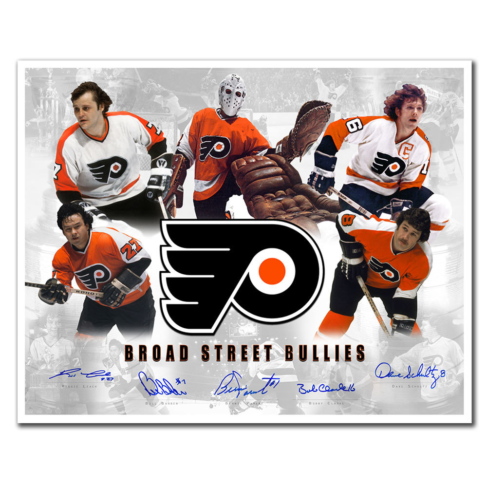
Call me a traditionalist – but the only “third-jersey concepts” I’m interested in are the ones that involve the first original concepts, or the ones that are by widely considered “classic designs”. The Bruins jerseys from the Bobby Orr era, the Canadiens sweaters that once had Guy LaFleur and his flowing hair in them. The Neal Broten era Minnesota North Stars crest, and the Broad Street Bully-era Flyers design – I love them all.
Clean lines with minimal clutter. They get the job done, and are nostalgic reminders to the fans of the franchises golden years. They don’t scream cheap thrown together designs with the sole intent to make someone’s pockets thicker. As a fan, I’d rather that the NHL shy away from the NBA-model. The second I start seeing player names under the player’s numbers on the back of their sweaters, or alternative team nicknames on the fronts – I’ll be convinced that they’ve officially jumped-the-shark.
How about we don’t do that, and embrace the traditions of the sport, instead of always trying to be “progressive” with EVERY decision made. Yes, I understand at the end of the day that it’s all a business – and all of these decisions are based on making money.
But I’d like to think hockey fans, overall, are a different breed.
The vast majority of fans do not want fighting to be phased out, and appreciate the role of the enforcer. They don’t need games to have 7-plus goals scored to be entertained. They don’t need every aspect of the game to be scrutinized via video replays.
They appreciate the game for what it is – without the fluff…
Thinking that the fans need to be force-fed ridiculous logo designs made by the same people who made the latest Kanye West album cover for the only purpose being to make a quick buck – just like the fisherman logo, let that train-of-thought die…
Follow/trash me on Twitter – @brasqo
Tags 1995 1996 bobby broad bullies fisherman Guy Islanders jersey lafleur mike milbury north orr stars street third
Check Also
Biofile Michael Marley Interview
By Scoop Malinowski Status: Former newspaper boxing columnist, Vice President/press officer for Don King Productions ...